CASE STUDY: dutch
Pet parents want the best for their pets, yet many are forced to wait weeks to get the care they need—or don’t get it at all. They’re hungry to talk to real vets; it just needs to be faster, easier, and more affordable. Dutch, a virtual veterinary platform offering on-demand care and prescriptions, bridges the gap between trustworthy expertise and empathetic care.
PERSONALIZED CONFIRMATION CONTENT
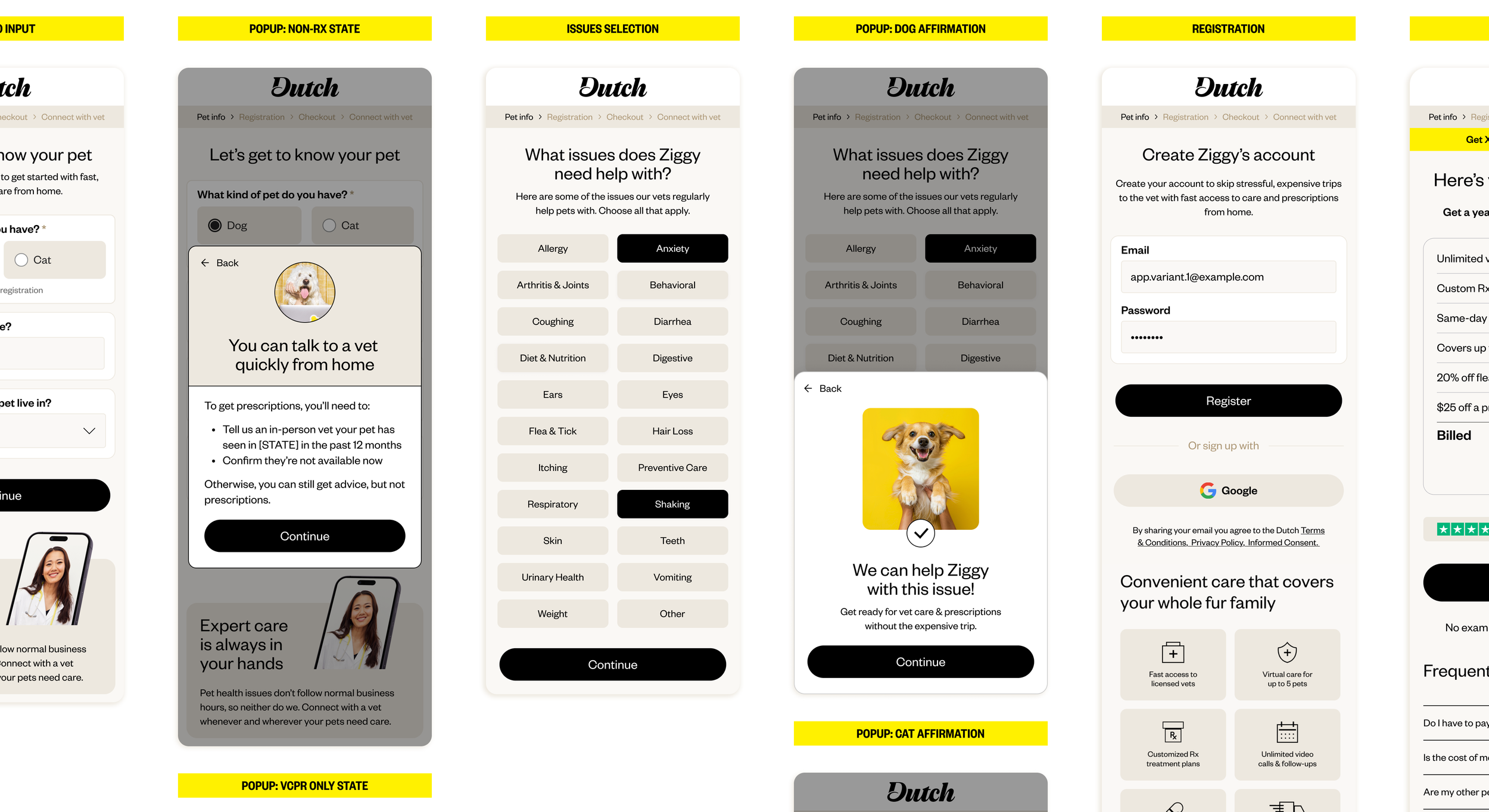
This work focused on the registration flow, where users decide whether to continue or abandon signup. At this stage, users were being asked to commit to a service without a clear sense of what care would look like or whether it was right for their specific pet. Drop-off between collecting basic pet information and prompting account creation suggested uncertainty was a major factor.
Our strategic bet:
If we personalized confirmation content based on pet type and age, users would feel more confident continuing—resulting in higher conversion.
CONSTRAINTS
This experiment needed to work with:
An existing design system and brand voice
Tight timelines and frequent coordination with engineering
Maintaining trust in a healthcare-adjacent space
Limited ability to add steps to the flow without increasing friction
APPROACH
We approached this through two targeted touchpoints:
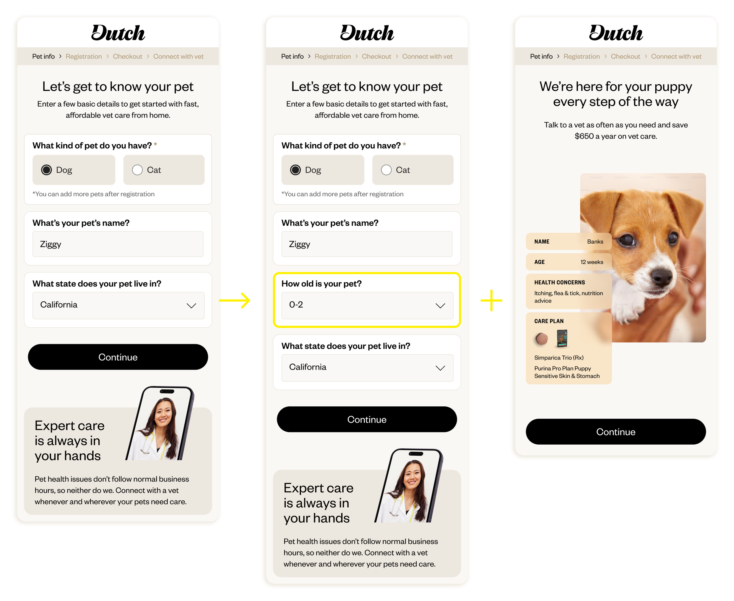
Introduced a lightweight question asking for the pet’s age during information collection
Used that data to personalize a confirmation page experience
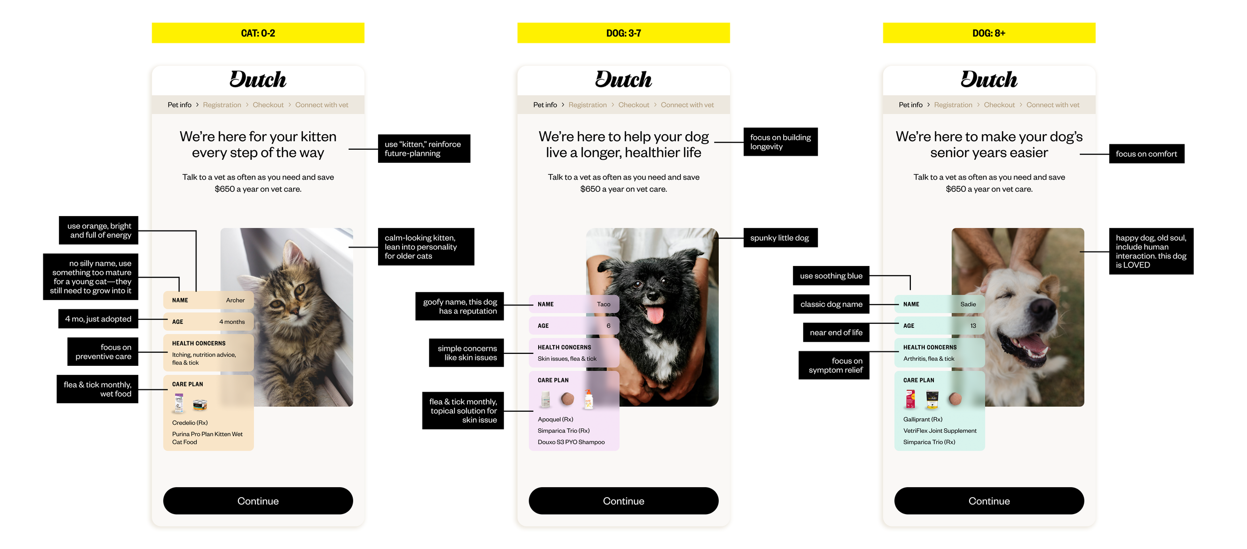
The confirmation pages required six content variations, based on pet type (dog vs. cat) and age group (young, adult, senior). Designing these experiences involved careful consideration of both emotional reassurance and clinical credibility.
Key decisions included:
Selecting imagery that felt authentic and brand-aligned
Listing example health concerns that were common, appropriate, and relatable
Choosing example care products that felt relevant without overwhelming
Using playful details, like pet names, to humanize the experience without undercutting trust
Below are representative examples of the personalized confirmation experiences tested.
OUTCOMES
Personalized confirmation pages resulted in a +11.7% increase in conversion compared to the control
The winning variant shipped as the default experience
The experiment reinforced the value of relevance and reassurance at key decision points
This proved to be a high-impact improvement with a relatively minimal lift—leveraging what’s uniquely Dutch: meeting people where they are, validating their instincts, and giving them the tools to make informed decisions, all without judgment, jargon, or pressure.
LEARNINGS
Small moments of personalization can significantly increase confidence without adding friction
Users respond more strongly to clarity and relevance than to feature depth
Emotional reassurance is a legitimate and powerful conversion lever in care-based services
ROLE
I led the design for this experiment, including concept development, visual direction, and collaboration with copywriting, product, and engineering partners. I worked closely with stakeholders to clarify hypotheses, review variants, and interpret results.
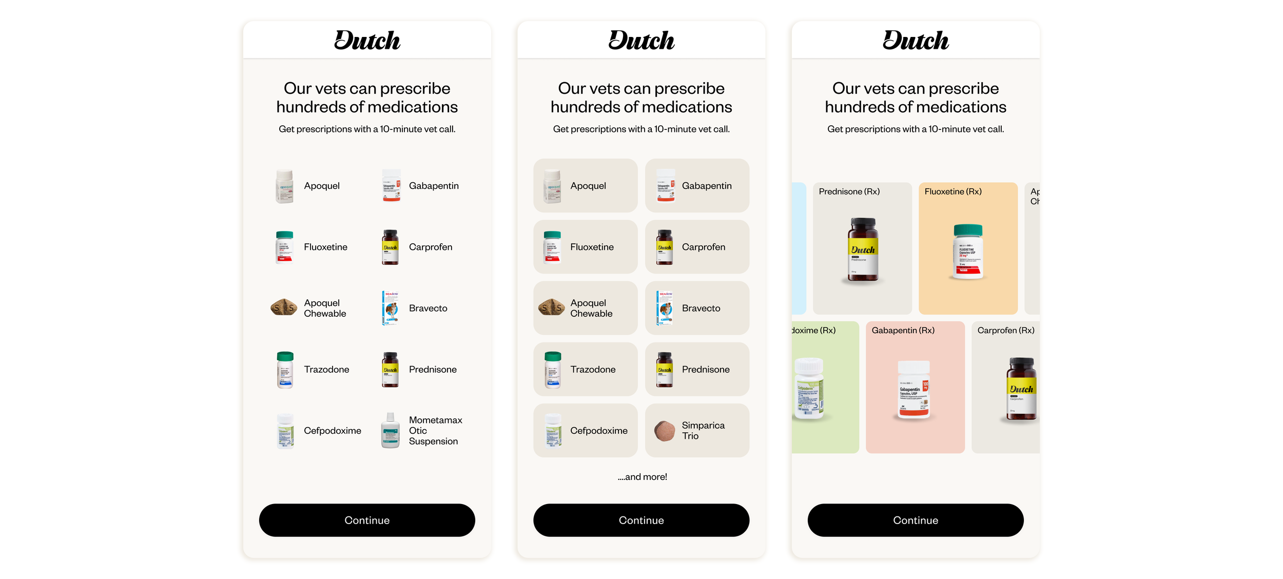
ADDITIONAL EXPERIMENT
Prescription Snapshot Screen
Introduced a pre-registration screen for users seeking prescriptions, resulting in a +16.6% increase in conversion compared to the control.